Why I Built TealSub
An AI chatbot built for SaaS founders who want to show up helpfully where their customers already are.
Running a SaaS is hard enough.
You’re shipping features, talking to users, fixing bugs, and somehow still expected to be everywhere online.
I kept noticing the same problem.
People were already talking about the exact problems my product solved.
They were asking questions.
They were looking for recommendations.
But most founders either missed those conversations completely…
or showed up in a way that felt forced and salesy.
I wanted something better.
Something that could quietly find the right conversations
and help you reply in a way that actually feels human.
Not spam.
Not generic AI fluff.
Just helpful, natural responses that sound like they came from someone who understands the problem.
That’s how TealSub started.
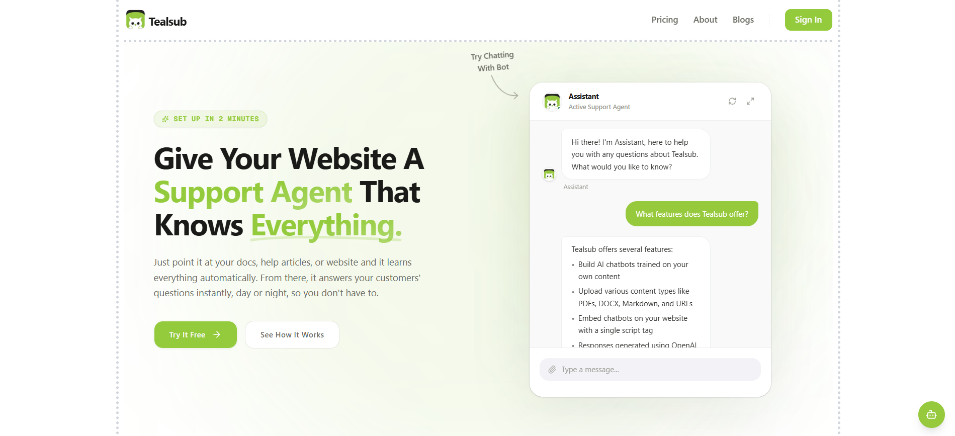
TealSub is an AI chatbot built for SaaS services.
It helps you discover high-intent conversations related to your product and drafts thoughtful, user-specific replies that feel natural instead of promotional.
The idea is simple:
show up where your potential customers already are,
and be genuinely useful.
I didn’t want to build another complicated marketing tool.
I wanted something that removes the friction of constantly monitoring conversations and figuring out what to say.
Drop in your product context.
Let the system surface relevant opportunities.
Get replies that sound like you.
Then review, tweak if needed, and move on.
If you’re building a SaaS and want a smarter way to engage without sounding like a bot, you can try it here:
https://tealsub.com
I’m still improving it every week based on real usage.
Would love any feedback if you give it a spin.